


Show Advice: How To Make a Proper Flyer

The Heligoats Poster, Art: Eric Castorena
It may seem petty or strange to state, but it seems to me that there are bands and occasionally promoters who don’t seem to know how to make a proper show flyer or poster. To make, sometimes five or six shows in one night, I need that order to be what I convey it as, so I can hop from show to show in order to catch the bands in a timeline of sorts. However, in recent months, I’ve found that many times the order I perceive is not the actual order. One such occasion occurred last week, making me ask, do these bands and acts actually know how to make a proper flyer? The following examples will answer any questions you may have to end confusion for myself, and anyone else that you want to attend your show.
For starters, I’ve always felt that the art, no matter what it is, shouldn’t deter from the task at hand. In this case, the task is promoting your live performance, or whatever. A flyer is promotion and in a sense advertising. Think of a billboard you interacted with or one that you didn’t and consider those when the poster is made. Though it may look cool to have the names artfully displayed, remember that in its physical form, most people will only interact with the flyer for a brief moment. I myself have found that no more than about six seconds is all that I’ll spend looking at something. So, that means that you should make the information as clear as possible, no matter what it is. This is really true for digital formats as well, though you need to remember that most people won’t devote more than about four seconds to something unless it’s engaging. This seems confusing, but it basically means that concise information with clearly placed data alongside art that’s worth appreciating all go together. We all live in a world where advertising is hurled at us from all angles, and where the best ones stick with us. Try your best to keep the poster from being confusing and you’ll have better results. An example of what I’d call confusing is displayed below.

Young Mammals/Young Girls Poster, Art: Eric Castorena
Though most people in Houston that go see bands would more than likely know that Young Mammals would headline a show with Young Girls, but you have to remember that the goal here is to get everyone who sees the poster or flyer to attend, not just those who you already know. As it turns out, this was a shared headline show, but it’s still a bit confusing to the eyes. Though, after finding out the story behind it, I applaud Castorena for conveying it like he did. The flyer below is closer to what a good flyer looks like.

The Tontons Poster, Art: Eric Castorena
Granted, many times door price won’t be on a flyer, but it never hurts. This particular poster was for a show that was FREE with RSVP, and it was technically sold out on the night of the show. Plainly stated below beautiful artwork, the headliner is on top, with the direct support and opener placed in order. Anyone who sees this piece digitally or physically, immediately knows that The Tontons are the headliners, with Say Girl Say on prior, and Dollie Barnes as the opener. The when and where, August fifth at Continental Club, are also in plain sight. As a bonus, the cost, the door time, and the show time are all clearly posted, and it’s a great example of what to strive towards.
Keep in mind, Eric Castorena is a professional artist, and you don’t have to hire one for your flyer, in fact as I can tell, many of you choose not to go that route, and that’s fine. However, the way your poster or flyer looks should always be clear, with all of the important information clearly displayed, and unless one of the bands has a sick member, you should attempt to stay with the same lineup as what you’ve advertised. Since the flyer and or poster are both advertising in a sense for your performance, keeping things simple while also engaging doesn’t have to be high art, but it also shouldn’t be confusing either. The same should be noted for your Facebook event profiles as well, but that’s a different lesson for a different time.
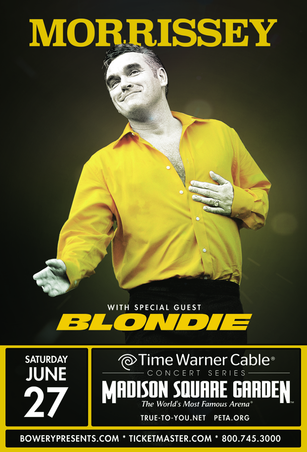
No matter what someone may tell you, the headliner or whoever is playing last is always on top. You don’t need to take my word for it, just look around the internet at posters for acts like Morrissey, Kanye West, or even festivals like Coachella. The headliner being on top has always been perceived as the show’s closer. Granted, though I know that lineups can often change, but keeping the confusion to a minimum will help insure that no one shows up angry and that you have plenty of people there for the correct times. I can’t remember one time where I showed up to a show in time for the act as per what the flyer had posted, and was happy that the band on top who I perceived as being the last of the night; had actually played first. Being a patient and understanding person, I usually know what happened. However you might want to consider that those attending your show, might not be happy at all, and might not ever go see one of your shows again if the order on the poster is confusing or incorrect.
- Jose P


![20DTickets_300x300[4]](http://wpimages.freepresshouston.com/2017/05/20DTickets_300x3004-300x300.jpg)

